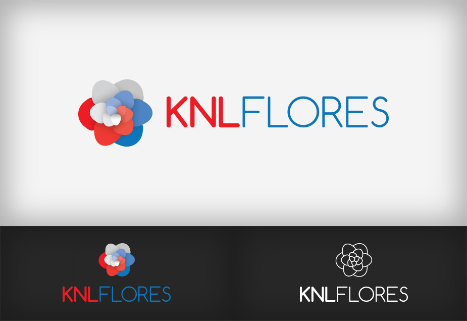
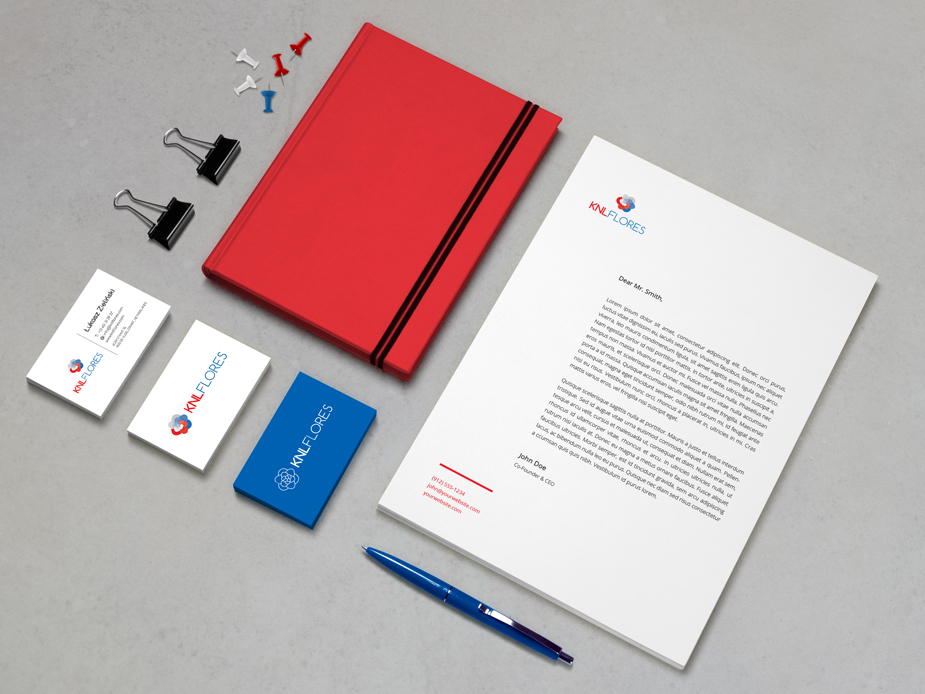
KNL Flores Logo
The history of this logo is quite simple – it had to be a floral design in the colors of the Netherlands flag. Flower itself wasn’t specified, it could even resemble a rose. Ultimately, however, I chose a symmetrical arrangement of petals, which together is not similar to any particular plant. Reconciling the two dominant colors which are red and blue was not an easy task. Eventually I managed to get the logo, which in its basic color version looks good against the light and dark background.


